Price Chart
Nydar's chart widget provides interactive candlestick charts with 105 technical indicators, multi-timeframe analysis, and drawing tools
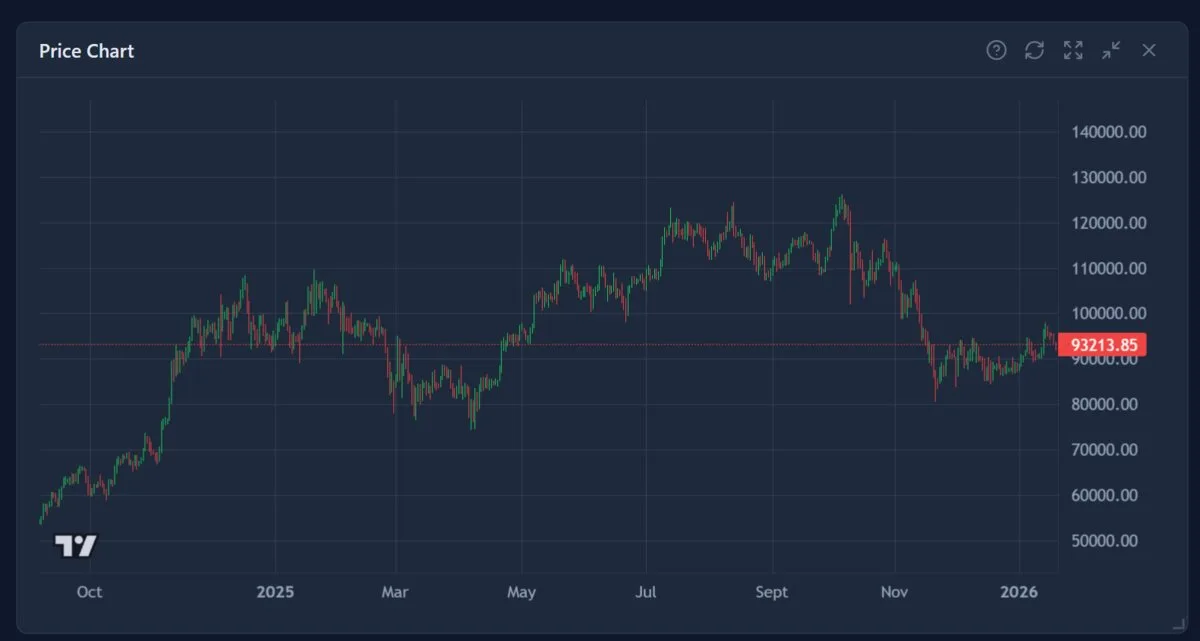
What Is the Price Chart Widget?
Nydar's Price Chart widget displays real-time candlestick data for any symbol on your watchlist across six timeframes — 1m, 5m, 15m, 1h, 4h, and 1d. It streams live OHLC updates via WebSocket, supports smooth zooming and panning, and pairs with 105 technical indicators for full chart analysis.
The chart uses the lightweight-charts library for professional-grade rendering, including fullscreen mode and real-time volume bars. See the candlestick chart glossary entry for terminology.
The analytical foundations behind charting are covered in John J. Murphy, Technical Analysis of the Financial Markets(New York Institute of Finance, 1999) — the most widely cited reference for Western chart analysis covering trend theory, moving averages, and oscillators. For candlestick-specific patterns, Steve Nison's Japanese Candlestick Charting Techniques(2nd ed., Prentice Hall, 2001; originally 1991) introduced Eastern candlestick methodology to Western traders and remains the definitive text on pattern recognition. A more recent quantitative perspective can be found in Thomas Bulkowski, Encyclopedia of Chart Patterns (3rd ed., Wiley, 2021), which back-tests 75 chart patterns across 25 years of equity data.
Nydar's Chart Features
Real-Time Data
Nydar streams live price updates via WebSocket. Candles update in real-time as trades occur on the exchange.
Multiple Timeframes
Nydar offers 6 timeframes — 1m, 5m, 15m, 1h, 4h, and 1d — to analyze short-term moves or long-term trends.
Candlestick Display
Nydar displays full OHLC (Open, High, Low, Close) data as Japanese candlesticks with colour-coded volume bars.
Fullscreen Mode
Nydar's fullscreen mode expands the chart for detailed analysis. Press Escape or click the shrink button to exit.
How Do I Use the Price Chart?
To use Nydar's Price Chart, select a symbol from your watchlist, pick a timeframe, then zoom and pan through price history. Hover over any candle to see its open, high, low, and close values. Use fullscreen mode for detailed analysis on larger screens.
Step 1: Select a Symbol
Click any symbol in Nydar's Watchlist widget. The chart automatically loads data for that symbol. Nydar displays the currently selected symbol in the header bar.
Tip: Set up your watchlist in Settings → Watchlist to add the symbols you want to track.
Step 2: Choose Your Timeframe
Use the timeframe buttons in the header (1m, 5m, 15m, 1h, 4h, 1d). Each button changes how much time each candle represents:
- • 1m/5m: Scalping and very short-term moves
- • 15m: Day trading, intraday swings
- • 1h: Swing trading, identifying daily patterns
- • 4h: Multi-day trends, position trading
- • 1d: Long-term trends, weekly/monthly analysis
Step 3: Navigate the Chart
Use these controls to explore the price history:
- • Mouse wheel: Zoom in/out on the time axis
- • Click + drag: Pan left/right through history
- • Double-click: Reset view to current price
- • Hover: See OHLC values for specific candles
Step 4: Analyze Patterns
Look for support/resistance levels (prices where the market repeatedly reverses), trend lines (connecting highs or lows), and candlestick patterns that might indicate reversals or continuations.
What Do Candlestick Patterns Tell You on Nydar's Chart?
Nydar's candlestick patterns reveal the battle between buyers and sellers within each time period. A green candle means buyers won (close above open), while a red candle means sellers won. Long wicks show price rejection at extremes, and specific multi-candle patterns like engulfing or morning star formations signal potential reversals.
Anatomy of a Candlestick
Bullish (Green) Candle
- • Opens at bottom of body
- • Closes at top of body
- • Upper wick = high price
- • Lower wick = low price
- • Indicates buying pressure
Bearish (Red) Candle
- • Opens at top of body
- • Closes at bottom of body
- • Upper wick = high price
- • Lower wick = low price
- • Indicates selling pressure
Common Candlestick Patterns
Doji
Open and close are nearly equal, creating a cross or plus shape. Signals indecision in the market. When appearing after a strong trend, it can indicate a potential reversal. The longer the wicks, the more significant the indecision.
Hammer / Hanging Man
Small body at the top with a long lower wick (at least 2x the body). When appearing at the bottom of a downtrend, it's called a Hammer and signals bullish reversal. At the top of an uptrend, it's called a Hanging Man and signals bearish reversal.
Engulfing Pattern
A large candle that completely "engulfs" the previous candle's body. Bullish engulfing (green candle engulfing red) at the bottom of a downtrend signals reversal. Bearish engulfing (red engulfing green) at the top of an uptrend signals reversal.
Morning Star / Evening Star
Three-candle reversal pattern. Morning Star: large red candle, small-bodied candle (gap down), large green candle. Signals bullish reversal. Evening Star is the opposite, signaling bearish reversal.
Three White Soldiers / Three Black Crows
Three consecutive large candles in the same direction. Three White Soldiers (green) signals strong bullish momentum. Three Black Crows (red) signals strong bearish momentum.
How Do I Choose the Right Timeframe on Nydar?
Choose your Nydar chart timeframe based on your trading style: 1m-5m for scalping, 15m for day trading, 1h for swing trading, 4h for position trading, and 1d for long-term trend analysis. Always check one timeframe higher for context — if you trade Nydar's 15m chart, confirm the trend on the 1h.
Identifying Trends
Use higher timeframes (4h, 1d) to identify the overall trend direction:
- • Uptrend: Series of higher highs and higher lows
- • Downtrend: Series of lower highs and lower lows
- • Sideways/Range: Price bouncing between horizontal support and resistance
Remember: "The trend is your friend." Trading with the trend has higher probability of success.
Finding Entry Points
After identifying the trend on higher timeframes, use lower timeframes (15m, 1h) to find precise entry points:
- • In uptrend: Look for pullbacks to support levels or moving averages
- • In downtrend: Look for rallies to resistance levels
- • Wait for confirmation (reversal candle pattern) before entering
- • Don't chase - if you missed the entry, wait for the next setup
Setting Stop Losses
Use the chart to identify logical stop loss levels:
- • For longs: Place stop below recent swing low or support level
- • For shorts: Place stop above recent swing high or resistance level
- • Consider ATR (Average True Range) for volatility-based stops
- • Never move your stop loss further away from entry
Multi-Timeframe Analysis
Professional traders use multiple timeframes together:
- • Higher TF (4h/1d): Determine trend direction and major S/R levels
- • Middle TF (1h): Find trading setups and patterns
- • Lower TF (15m): Fine-tune entry and exit timing
Rule: Never trade against the higher timeframe trend unless you're an experienced counter-trend trader.
Why Does Volume Matter on a Price Chart?
Volume confirms whether price moves have real conviction behind them. Breakouts on two times or more the average volume are likely to hold, while breakouts on low volume often reverse. Nydar's Price Chart displays colour-coded volume bars beneath every candlestick so you can spot divergences at a glance.
Healthy Trend Signs
- • Uptrend with increasing volume = strong buying conviction
- • Breakout on 2x+ average volume = likely to hold
- • Pullback on decreasing volume = healthy consolidation, trend likely to continue
Warning Signs
- • New highs on declining volume = exhaustion, potential reversal
- • Breakout on low volume = likely false breakout, will reverse
- • Spike in volume after extended trend = climactic move, potential reversal
Learn more in the Volume Analysis tutorial.
Common Mistakes When Reading Nydar's Charts
Seeing patterns everywhere
Human brains are pattern-matching machines — sometimes too good. Not every formation is a tradeable pattern. If you have to squint or tilt your head, it's probably not there. The best setups are obvious at a glance.
Trading the wrong timeframe
If you're a swing trader holding for days, don't make decisions on the 1-minute chart. Match your analysis timeframe to your holding period. Use the 1h-4h for entries, daily for trend direction.
Ignoring the left side of the chart
Don't just look at the last few candles. Scroll left to see historical levels where price reacted. A support level from 3 months ago can still be relevant today.
Troubleshooting Nydar's Chart
Nydar's chart shows no data or loading forever
- • Check if Nydar's WebSocket is connected (green dot in header)
- • Verify the symbol exists on Binance
- • Try refreshing the widget using the refresh button
- • Check browser console for JavaScript errors
- • Clear browser cache and reload the page
Nydar's data appears delayed or stale
- • Nydar's WebSocket may have disconnected — check the connection indicator
- • Backend server might need restart
- • Try selecting a different symbol and then returning
- • Check your internet connection stability
Chart is too small or cramped
- • Resize Nydar's widget by dragging its edges
- • Use Nydar's fullscreen mode (expand icon) for detailed analysis
- • Reset Nydar's layout from Settings menu to get default sizes
- • Remove unused widgets to give the chart more space
Candles look wrong or have gaps
- • Gaps are normal during low-volume periods or exchange maintenance
- • Some symbols have less trading activity - try major pairs like BTC/USDT
- • Weekend data for traditional markets will show gaps (crypto trades 24/7)
Pro Tips
- Multi-timeframe analysis is essential: Always check at least 2-3 timeframes before trading. The trend on the higher timeframe should guide your bias.
- Volume confirms price: High volume on breakouts increases reliability. Low volume moves often fail and reverse. Always check if volume supports the move.
- Don't over-analyze: If you can't see a clear setup within 30 seconds, there probably isn't one. The best trades are obvious. Wait for better opportunities.
- Round numbers matter: Prices like $50,000, $100,000 for BTC act as psychological support/resistance. Watch for reactions at these levels.
- Time of day matters: Crypto is 24/7 but US market hours (13:30-20:00 UTC) and Asian market hours (00:00-08:00 UTC) typically see more volume and volatility.
- Keep a trading journal: Screenshot your chart setups before and after trades. Review them weekly to improve your pattern recognition.
How Does This Widget Compare to Other Nydar Widgets?
Nydar provides several widgets focused on price visualisation. Here is how the Price Chart relates to them:
| Feature | Price Chart | Advanced Chart | Volume Profile | Footprint Chart | Indicators |
|---|---|---|---|---|---|
| Candlestick OHLC data | Yes — 6 timeframes | Yes — 6 timeframes | No | Per-candle breakdown | No |
| Volume bars | Yes — colour-coded | Yes — colour-coded | Horizontal profile | Bid/ask split | No |
| Technical indicators | No — use Indicators widget | 105 built-in overlays | No | No | 105 indicators |
| Real-time WebSocket updates | Yes | Yes | Yes | Yes | Yes |
| Volume at price (VAP) | No | No | Primary focus | Yes | No |
| Fullscreen mode | Yes | Yes | No | No | No |
| Best for | Quick price action analysis | Full technical analysis | Finding high-volume price levels | Order flow at each candle | Oscillators and overlays |
Related Nydar Widgets
Further Reading
Last reviewed: March 2026