What is Technical Analysis?
Technical analysis is a method of evaluating investments by analyzing price charts and trading data. Nydar supports 105 technical indicators across crypto, stocks, and forex — covering momentum, trend, volatility, and volume categories. Unlike fundamental analysis (which looks at company financials), technical analysis assumes that all relevant information is already reflected in the price.
The core idea: price movements follow patterns, and history tends to repeat itself. By recognizing these patterns, traders attempt to predict future price direction.
Understanding Candlestick Charts
Candlestick charts are the most popular chart type among traders. Each "candle" shows four prices for a time period:
- • Open: Bottom of body
- • Close: Top of body
- • Price went UP
- • Open: Top of body
- • Close: Bottom of body
- • Price went DOWN
The thin lines above and below the body are called "wicks" or "shadows" - they show the high and low prices reached during that period.
What Candle Shapes Tell You
The size and shape of each candle gives clues about market sentiment:
Strong conviction. Buyers (green) or sellers (red) controlled the entire session with little opposition.
Indecision. Price moved a lot but closed near where it opened. Often seen at turning points. A doji is the extreme version — open and close are nearly identical.
Called a hammer at support. Sellers pushed price down but buyers fought back. Potential reversal signal.
Called a shooting star at resistance. Buyers pushed price up but sellers rejected it. Potential reversal signal.
For a deeper dive into candle patterns, see Nydar's complete candlestick patterns guide.
Chart Types Compared
Candlesticks are the most popular, but understanding all three chart types helps you choose the right one for your analysis:
| Chart Type | Shows | Best For | Drawback |
|---|---|---|---|
| Line | Close price only | Quick trend overview, clean support/resistance | Hides intra-bar volatility |
| Bar (OHLC) | Open, high, low, close | Full price data, less visual clutter than candles | Harder to read direction at a glance |
| Candlestick | Open, high, low, close + color-coded body | Pattern recognition, market sentiment | Can look cluttered on short timeframes |
Most traders use candlestick charts as their primary view and switch to line charts when drawing long-term trend lines.
Choosing a Timeframe
The timeframe determines how much data each candle represents. Your trading style dictates which timeframe to use:
| Trading Style | Primary Timeframe | Trend Timeframe | Holding Time |
|---|---|---|---|
| Scalping | 1m - 5m | 15m - 1h | Seconds to minutes |
| Day Trading | 5m - 15m | 1h - 4h | Minutes to hours |
| Swing Trading | 4h - Daily | Weekly | Days to weeks |
| Position Trading | Daily - Weekly | Monthly | Weeks to months |
Key principle: Always check a higher timeframe before trading. A 5-minute uptrend means nothing if the daily chart shows a strong downtrend. The higher timeframe wins.
Support and Resistance
Support and resistance are price levels where buying or selling pressure tends to emerge:
A price floor where buying pressure prevents further decline. Traders expect bounces from support levels.
A price ceiling where selling pressure prevents further advance. Traders expect pullbacks from resistance levels.
When support breaks, it often becomes resistance (and vice versa). The more times a level is tested, the more significant it becomes.
Essential Indicators
RSI (Relative Strength Index)
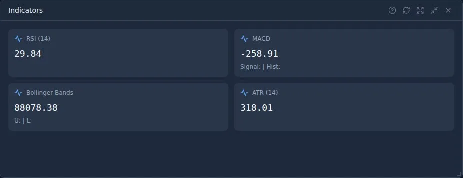
RSI measures momentum on a scale of 0-100. It helps identify overbought and oversold conditions:
- RSI above 70: Overbought - price may be due for a pullback
- RSI below 30: Oversold - price may be due for a bounce
- RSI at 50: Neutral - no strong momentum either way
MACD (Moving Average Convergence Divergence)
MACD shows the relationship between two moving averages. Key signals:
- MACD crosses above signal line: Bullish signal
- MACD crosses below signal line: Bearish signal
- Histogram growing: Momentum increasing
- Histogram shrinking: Momentum weakening
Moving Averages (SMA & EMA)
Moving averages smooth out price data to show the underlying trend:
- Price above MA: Uptrend
- Price below MA: Downtrend
- Short MA crosses above long MA: "Golden Cross" - bullish
- Short MA crosses below long MA: "Death Cross" - bearish
Common periods: 20 (short-term), 50 (medium-term), 200 (long-term). EMA reacts faster than SMA. For a complete guide, see Moving Averages: SMA, EMA, and Beyond.
Volume — The Confirmation Tool
Volume measures how many shares or contracts were traded in a period. It confirms whether price moves are genuine or likely to fail:
Strong move. Buyers are committed. Trend likely to continue.
Weak move. Fewer participants buying. Trend may be exhausting.
Strong selling. Panic or institutional distribution. Expect more downside.
Weak selling. Lack of follow-through. Potential support forming.
Rule of thumb: Never trust a breakout without volume confirmation. If price breaks through resistance but volume is below average, it's likely a false breakout.
Multi-Timeframe Analysis
Professional traders don't rely on a single timeframe. They use multiple timeframes to get the full picture — like zooming in and out on a map:
The Three-Screen Method
Higher timeframe — Identify the trend
Look at the daily or weekly chart. Is the overall trend up, down, or sideways? Only trade in this direction.
Middle timeframe — Find the setup
Look at the 4h or 1h chart. Wait for a pullback within the trend. Check indicators (RSI, MACD) for entry signals.
Lower timeframe — Time the entry
Zoom into the 15m or 5m chart. Look for a precise entry with a tight stop loss. Enter when the short-term direction aligns with the higher timeframes.
Example: The daily chart shows an uptrend. The 4h chart shows RSI pulling back to 40 (not oversold, but below 50 — a pullback within the trend). You zoom into the 15m chart and buy when a bullish candle forms at a support level. Your stop is tight because you're using the lower timeframe, but your target is based on the higher timeframe's structure.
Putting It All Together
The best trading setups have "confluence" - multiple indicators pointing in the same direction:
Example of a Strong Buy Setup:
- ✓ Price bouncing off support level
- ✓ RSI coming up from oversold (below 30)
- ✓ MACD crossing above signal line
- ✓ Price above 200-day moving average
Building Your Analysis Workflow
When you sit down to analyse a chart, follow this systematic process. It keeps you objective and prevents impulsive trades:
Common Beginner Mistakes
Using too many indicators
Adding 10 indicators to your chart creates confusion, not clarity. Start with price action + one trend indicator (like a moving average) + one momentum indicator (like RSI). Add more only if each one gives you genuinely new information.
Ignoring the higher timeframe
A buy signal on the 5-minute chart means nothing if the daily chart is in a strong downtrend. Always check the bigger picture first.
Looking for the "perfect" indicator
No indicator predicts the future. They all measure the same underlying price data in different ways. Focus on understanding price action and use indicators for confirmation, not prediction.
Curve-fitting to the past
It's easy to find an indicator setting that "works perfectly" on historical data. This doesn't mean it will work going forward. Test your strategies on out-of-sample data using backtesting.
Analysis paralysis
Spending hours analysing every indicator on every timeframe, then being too afraid to trade. Set your rules in advance, and when conditions are met, execute. Paper trading is the cure — it lets you practise decisions without risk.
Technical vs Fundamental Analysis
Traders often ask: which approach is better? The answer depends on your timeframe:
| Technical Analysis | Fundamental Analysis | |
|---|---|---|
| Looks at | Price charts, patterns, volume | Earnings, revenue, economic data |
| Best for | Short-term timing (hours to weeks) | Long-term value (months to years) |
| Core belief | "Price discounts everything" | "Markets can misprice assets" |
| Works on | Any market (stocks, crypto, forex) | Mainly stocks, bonds, forex |
Many successful traders combine both: use fundamentals to decide what to trade (strong company, growing sector) and technicals to decide when to enter and exit.
Important Limitations
Technical analysis is not a crystal ball. Keep these realities in mind:
- No indicator works 100% of the time — they provide probabilities, not certainties
- Patterns can fail, especially during major news events, earnings surprises, or geopolitical shocks
- Past performance doesn't guarantee future results — markets evolve and strategies stop working
- Technical analysis works best on liquid, high-volume instruments — avoid low-volume penny stocks
- Self-fulfilling prophecy: some patterns work partly because enough traders believe in them
- Use technical analysis as one tool among many, not your only tool
Next Steps
The best way to learn technical analysis is practice. Use Nydar's paper trading to:
- Identify support and resistance on real charts
- Practice reading RSI and MACD signals
- Look for confluence between multiple indicators
- Test your analysis with virtual trades
Further Reading
- Investopedia: Technical Analysis overview — Indicators, chart types, and price action basics
- Investor.gov: Understanding investment products — Official US investor education resource
Written by Ryan Clinton
Founder of Nydar. Software engineer with experience at Cowen Inc (Wall Street) and on large-scale infrastructure projects. Built Nydar to make professional trading tools accessible to everyone.
Last reviewed: March 2026